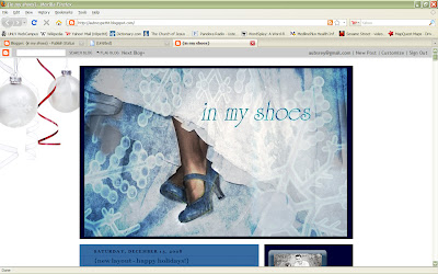
This post took me FOREVER.... hope it's helpful for those trying to figure it out.
Although the other layout was super easy - I spent quite a bit of time on this one. I want to help by giving a little bit of a vintage photoshop technique that I use with Photoshop Elements 5.0 You can maybe adapt it, but this is the best I know how to do with this lower version. Any tips are of course helpful as well:
Step 1: Crop photo to your liking These are two photo examples:


Step 2: Duplicate layer - set layer filter to 'color dodge' then change this layer's opacity to 50-60 % depending on the image. leafs - 50, snow - 60
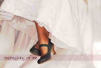
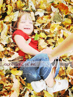
Step 3: In layers palette click on Create Adjustment layer. Then click on photo filter. Change the filter tone to Sepia. Change the density to about 50% then uncheck the 'preserve luminosity' box. Then click okay. Then change this layer's filter to 'multiply'. However on the 'Snow' one I wanted the shoes to stand out, not the legs, so I erased the legs to give them a less 'orangey' look overall.
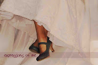
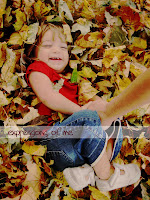
Step 4: In layers palette click on create Adjustment layer. Then click on brightness/contrast. You will want to increase both of these by different amounts for every photo, these were both raised about 20 points on each. On the leaves I did +10 for brightness and +30 for contrast. Then switch the layer filter to luminosity. Make it look like this. :)
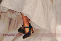
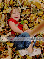
Step 5: In layers palette click on create adjustment layer. Then click on hue/saturation. Increase the saturation by about 20.
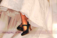

Step 6: In layers palette click on create adjustment layer. Click on hue/saturation again. Decrease saturation by about 20-40.
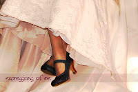
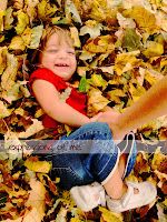
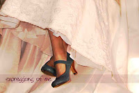
Voila!
Tips: Use the burn tool to darken areas of the picture or use the eraser if you don't want a certain filter applied to parts of the picture.
before: after:
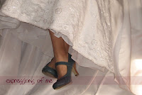
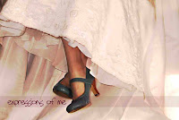
before after
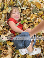
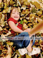
To make it cool as a header I wanted it to have a snow effect for the winter season, but I didn't it want to scream SNOWFLAKE!!! So I overlayed it with an image from online. Sorry I don't remember where I got it or I'd source it. However I didn't like the placement of the images so I copied it twice, overlayed them and then decreased the opacity on these layers.
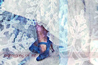
After some erasing, burning, etc. add the text and you get this...



1 comment:
wow-your amazing---that is sooo much work...I think it is awesome but I think my simple brain will have to stick with the other layouts that are made for me. :)
Post a Comment